Honest Tonics
Brand / Messaging / Packaging / Formulation
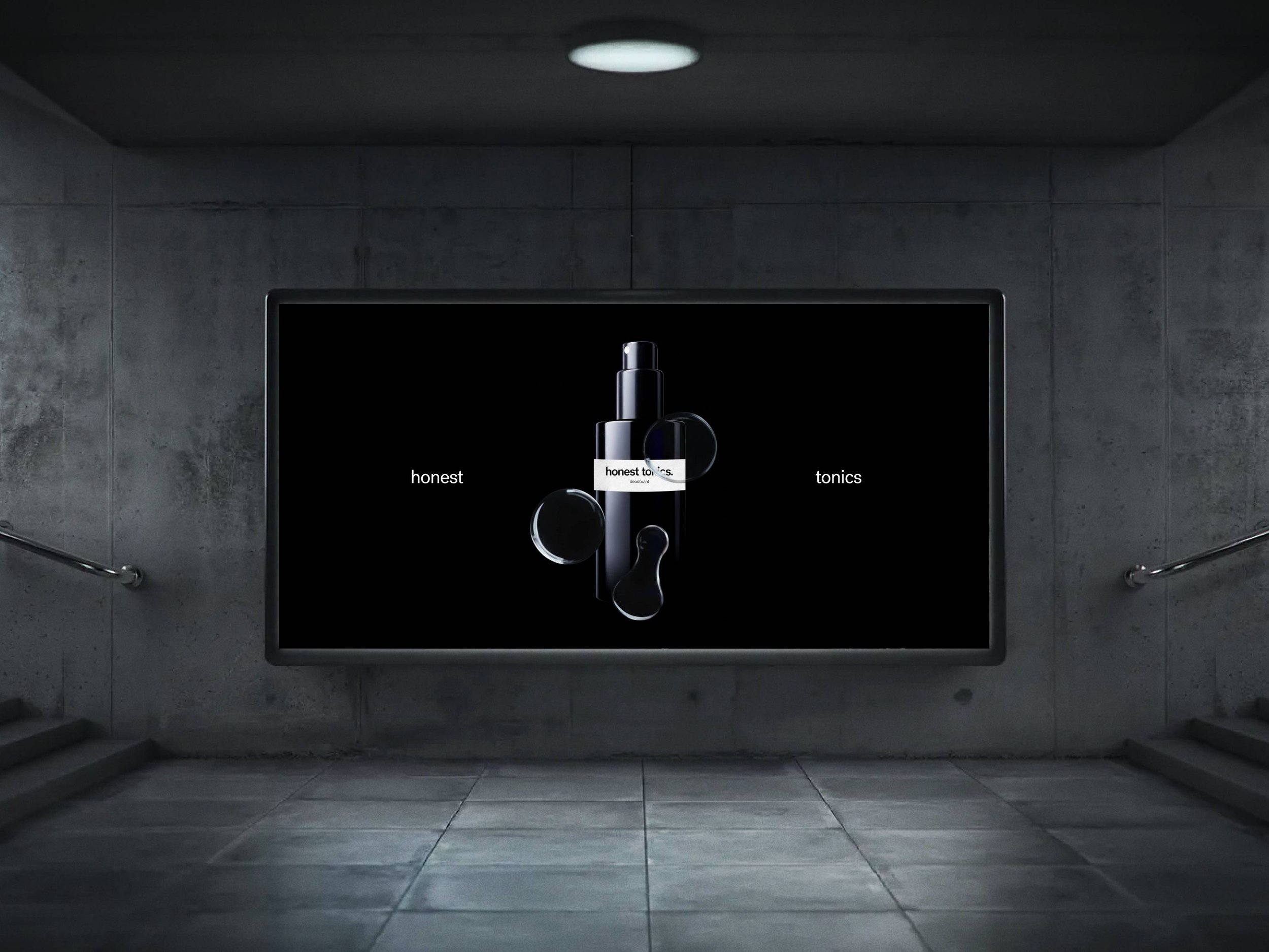
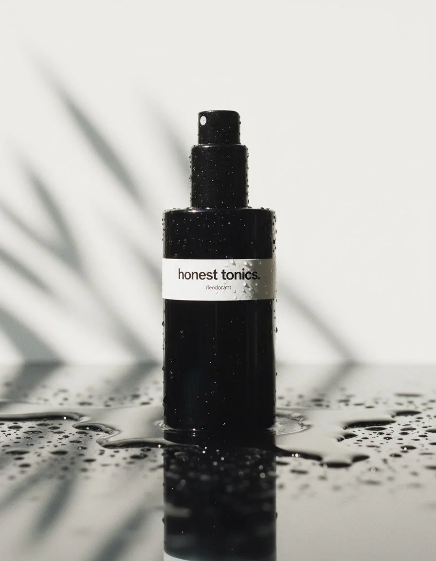
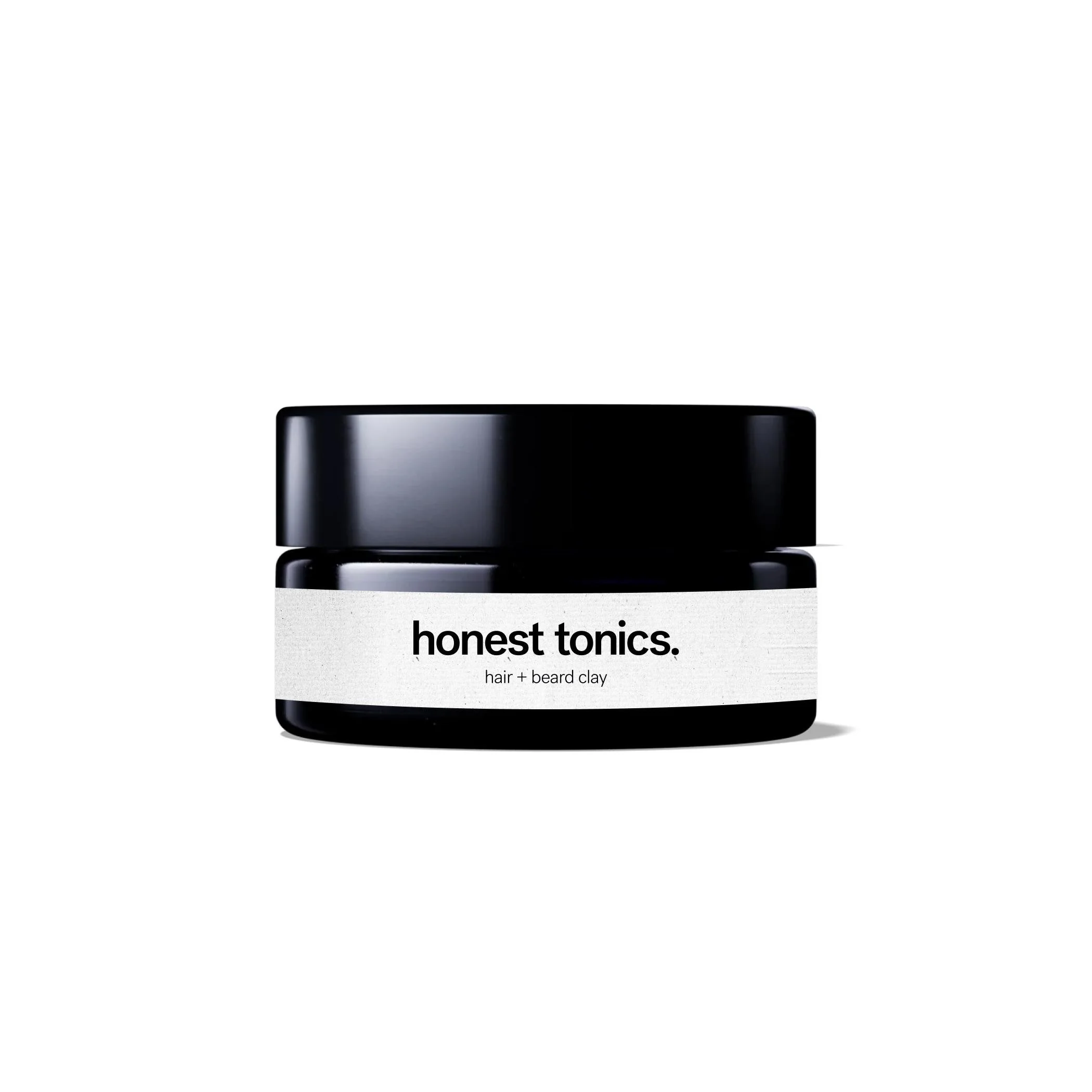
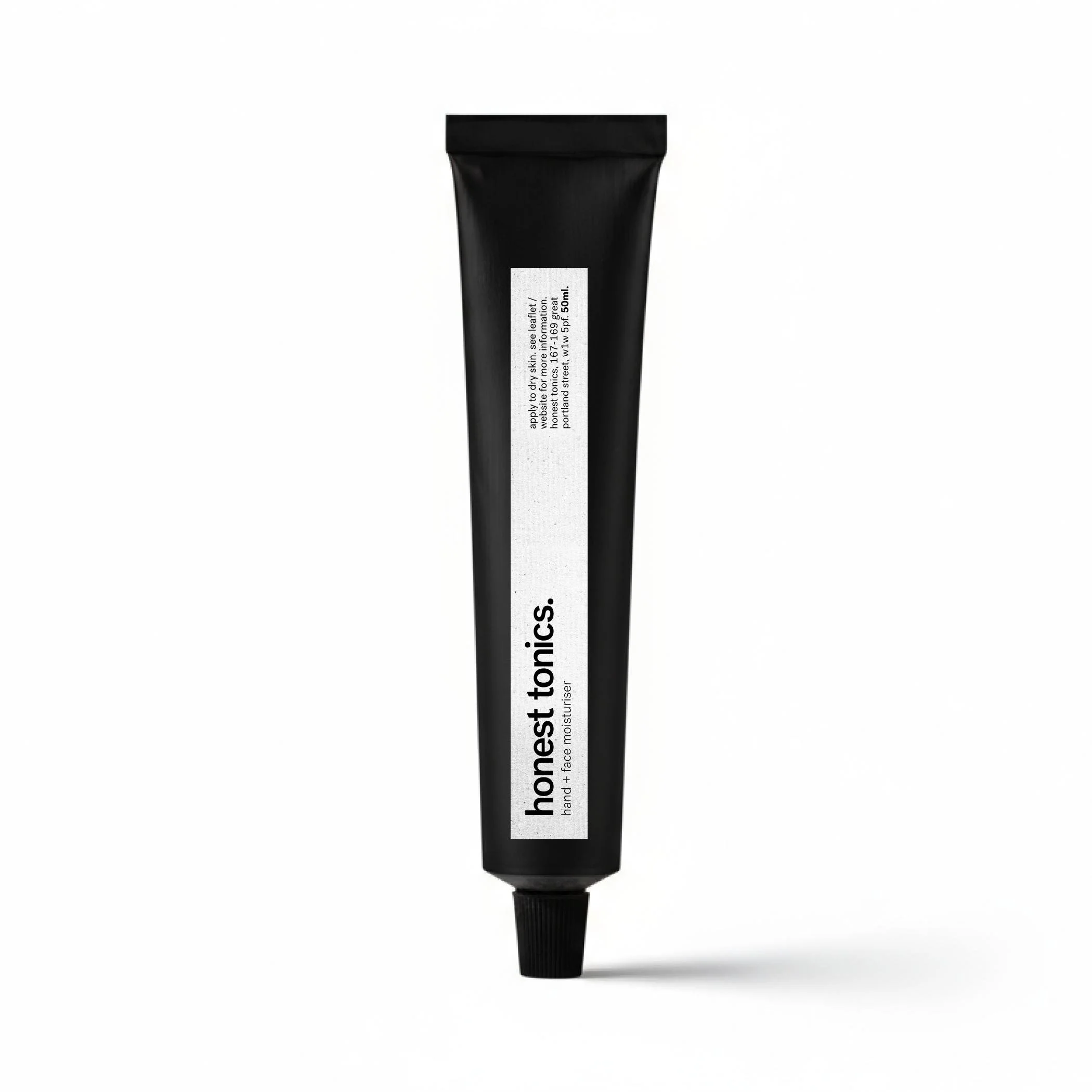
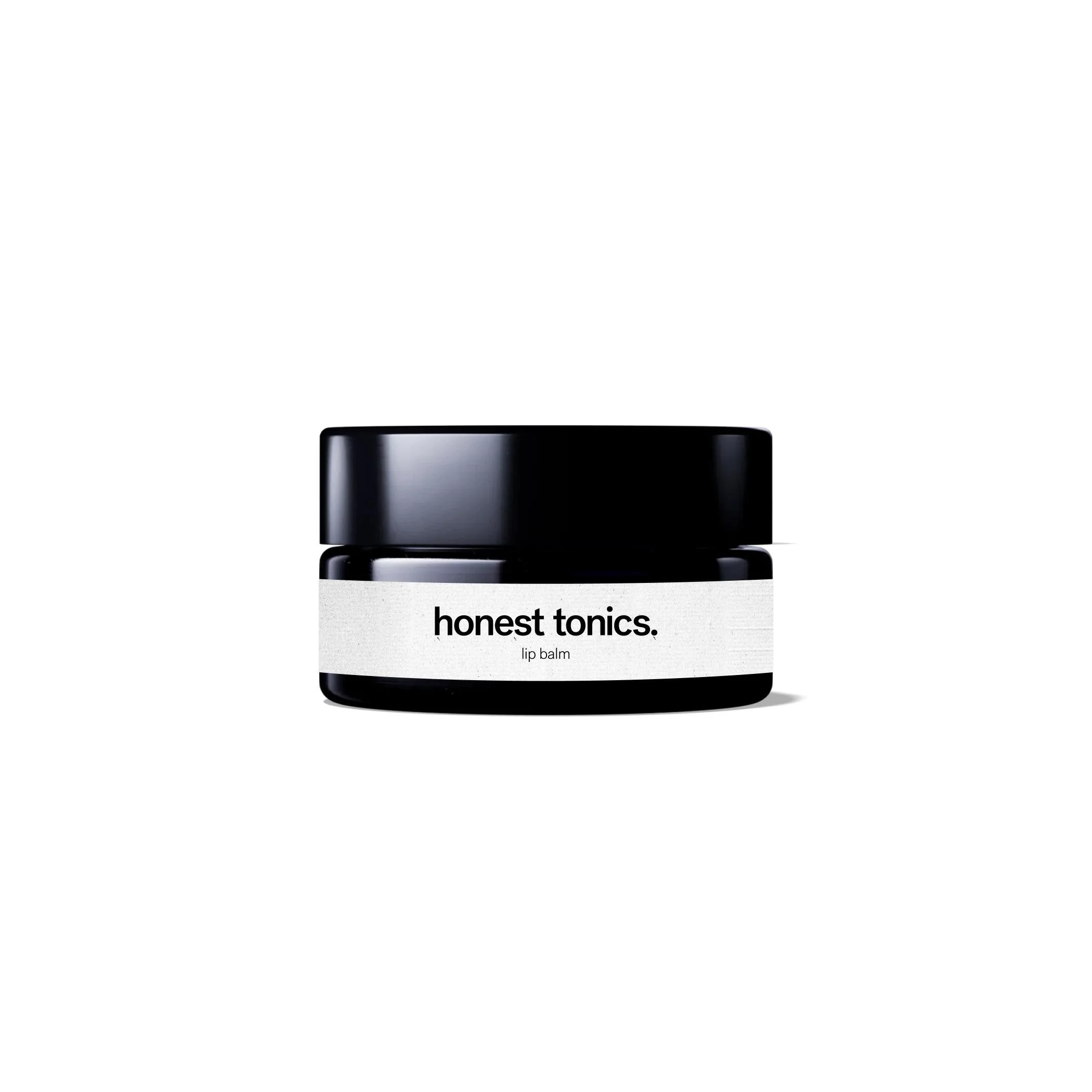
I led the visual identity and packaging design for Honest Tonics, a premium natural skincare brand with a subtle masculine lean. The logo, colour palette, typography, and packaging were crafted to feel straightforward, dependable, and modern. Communicating trust and effectiveness without overtly targeting men. Supporting brand assets reinforce a clean, premium aesthetic that resonates with a male-leaning audience while remaining inclusive.
Build a premium, human brand built on purpose, clarity and restraint.
Mission.
The black and white palette reinforces the brand’s minimalism, stripping away distraction and signalling a clear, functional focus on simple, well-considered formulations.
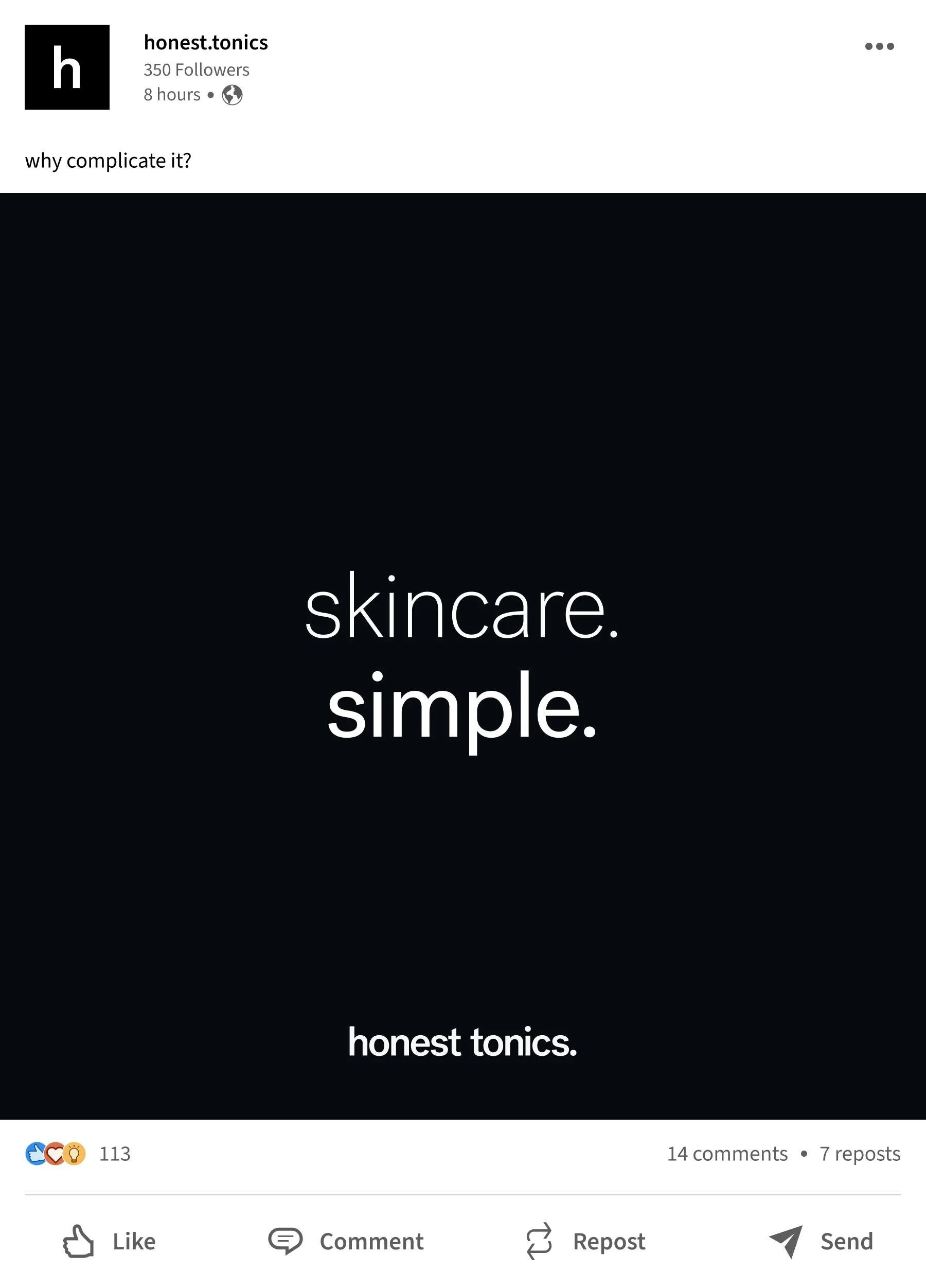
skincare.
made simple.
launch #1: deodorant.
Launch 2026/27:

Our beliefs
Make things that deserve to exist.
Create with intent. No fillers. No shortcuts. Just thoughtful, purposeful products that earn their place in households and in hands.
Create joy in everyday experiences.
Objects we interact with have an impact on us. The things we use everyday should be a joy to see, smell and touch.
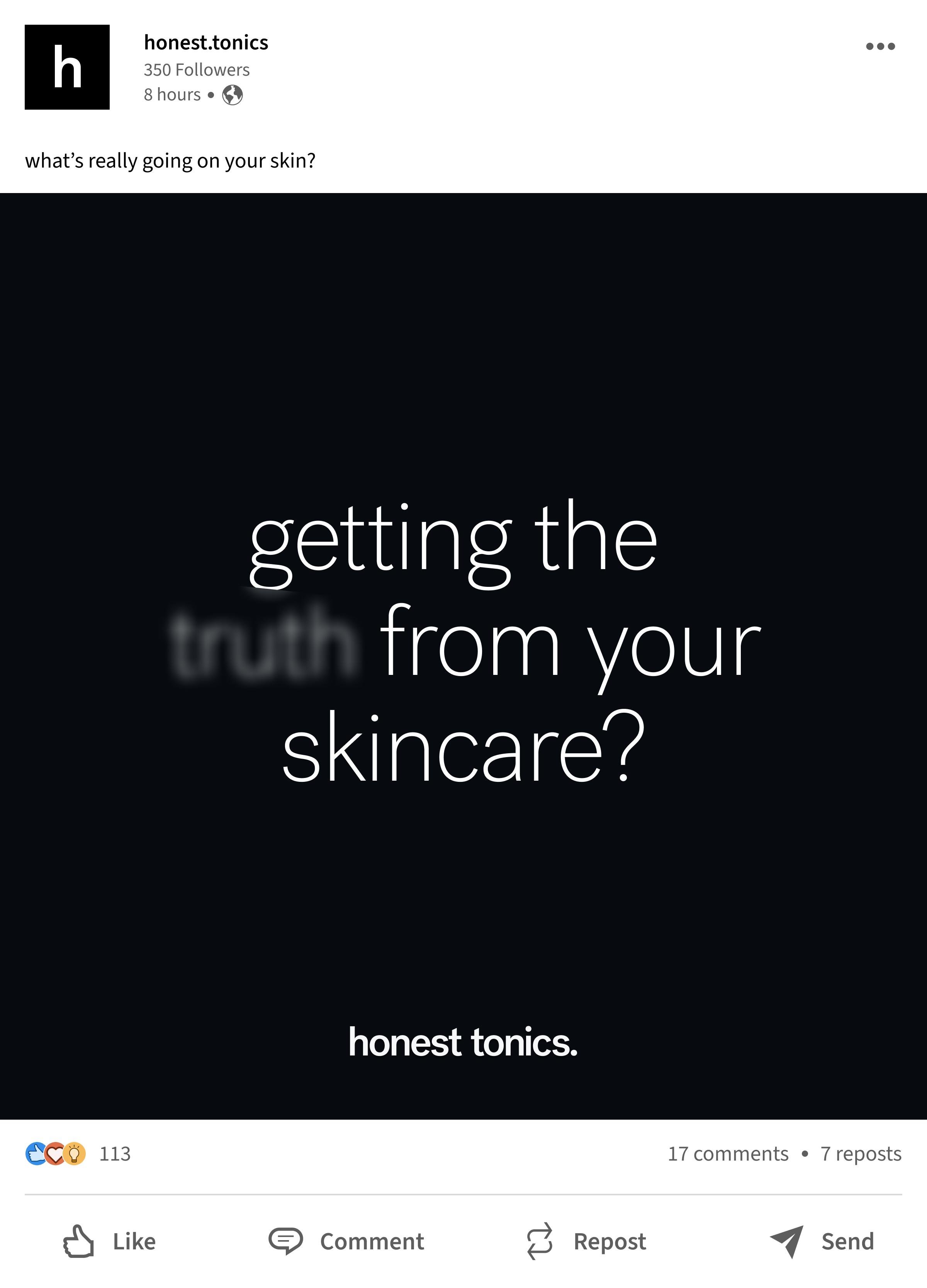
Trust through transparency.
Our customers deserve clarity. Build trust by being honest, consistent and transparent, even when it’s hard.